The Little Things
Most of the time, I blog about bold, more or less revolutionary ideas for KDE software which may or may not be realized at some point in the future. I do that because I think those may be the most interesting for you, dear blog audience, to read about.
The majority of my time spent on KDE, however, is spent working on details. To illustrate that work, I picked two examples of where I think I made a difference by caring about the details.
One of my favorite little details where I could help was with the “Send Later Agent” in Kmail.
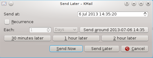
BEFORE: Original design for the Send Later Agent
When I saw the original design for the dialog for setting up a job for the agent, I was immediately reminded of what I often said about user interfaces in the web-based software I once worked on: “It feels like the database is staring right at me through the user interface!” I had this impression whenever the user interface merely exposed all accessible database fields, without any consideration of what may be useful to the user in which situation, which controls belonged together, etc. Developers are usually incredibly smart people, but many tend to see things from a technical perspective. As long as there’s a control for every field users should be able to change, and a button for every action they might want to do, it’s fine for them.
The original design of the send later dialog was pretty much like that: It was plastered with buttons for pretty much every action you could think of, date and time was set with a single edit field with a spinner where users would have to enter a formatted date/time manually, controls were placed in a way that would make it almost impossible for users to see which ones belong together. Plus, if users would have accidentally clicked the most prominent of the three (!) confirmation buttons, they would have sent an email which was meant to be sent later immediately, which might have lead to very embarrassing situations – or worse.
I liked the feature as such, as it allows you set up things like automatically sending birthday greetings every year or sending newsletters at a time where people are most likely to read them, but I knew the user interface had to change. After a little back and fourth with the developer (Laurent Montel) and Jos Portvliet via comments on the blog, we arrived at a much much simpler dialog with which users could still set up the same things, but in a much easier way.
AFTER 2: The Send Later Agent as it was released
Another overhaul I recently contributed to was the dialog for joining a Jabber chatroom in KDE Telepathy. At their sprint in mid April, the KTp team focused on their group chat experience, one aspect of which was the aforementioned dialog. Like the Send Later Agent dialog, it allowed users to do anything they might want to do, but wasn’t optimized for typical user workflows.
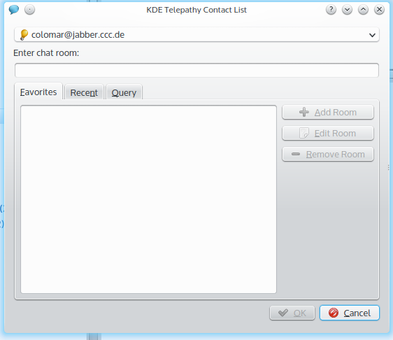
BEFORE: The Join Chat dialog up to KDE Telepathy 0.8.x
If users often joined the same rooms, they would either have to add them to the favorites (which would mean they had to enter the room address, click “Add Room” and then “OK” if they also wanted to join then, or else they’d have to change to the “Recent” tab every time they’d want to re-join the same room. The layout with the three buttons next to the listbox wasn’t optimal, either.
So we went ahead and streamlined it. I first thought “Okay, what are users most likely to want to do when they open the dialog?” We assumed that the majority of users have a few rooms they visit regularly or from time to time instead of joining completely new rooms very often. Therefore after selecting the account to use (which now also sports a label), users are now presented with a combined list of favorite and recently visited rooms (the checkbox next to the star will be gone in the final version) where they can just click a room and click “Join/Create” (now the button also has a label which says what it does instead of a generic “OK”). With this setup, users who don’t use too many different chat rooms don’t even need the Favorites feature because the list of recently joined rooms won’t get overcrowded anyway.

AFTER: The Join Chat dialog after the redesign
Only if they don’t find the room they want to join in the list, they have to enter it in the edit box below. And only if they don’t know the (exact) name of the room, users would have to change to the Search tab (which got a few improvements as well, such as a combined start/stop query button instead of two separate ones).
Here as well, no features were added or removed, but the user interface is now optimized for realistic user workflows.
Apart from these little before/after examples, I consider my work to be successful when I gained the trust of other contributors, because – due to a lack of organizational authority – trust is essential for usability work in a Free Software project.
That’s why I was very pleased when, for example, I heard senior members of the KDE Telepathy team tell newer members to “Just do as Thomas says.” when it comes to detailed usability questions. Not because they are obligated to do so, but because the senior members trust, based on their experience with me, that what I say usually makes sense.
Usability professionals not only have to work well with developers, though, but also with visual designers. Therefore I was equally pleased when Jens Reuterberg told me that he likes working with me because “you’re a usability guy who hasn’t told me to go fuck myself… yet”.
Comments: 13
Thank you, very much appreciate some thought and experience going into UI/Process flow design. The “Send Later ” dlg has particularly benefited from that.
Thank you very much for your lovely work!
Just for a future release, two simple ideas from my mind..
What about adding a timezone selection method and a recurrence counter to stop the ricurrence after a fixed number of executions or never ending it.
Yeah, this really matters a lot. For me, too, the Send Later has been a great friend 😉
I very much like the improvements shown here, especially the “Send Later” dialog has improved dramatically. Keep on the good work and show us more examples like that, so that we learn even more.
IMHO usability and visual design are closely connected to each other: good visual design improves the usability of the software because it helps the user to locate the interesting functionality faster and because it presents the functionality in a more pleasing way (and therefore gives the impression of good usability). So, usability needs visual design to be at its best. Conversely, visual design is useless if it doesn’t serve usability.
In the “Send Later” dialog, what is the meaning of “Delay”? Since I am about to press the “Send Later” button (there is no other confirmation button, which is good BTW), I already expect that the sending is going to be delayed. If leaving “Delay” unchecked is going to send the email immediately, then there is no point in choosing “Send Later” rather than “Send” (= send now). Since you can also select the current date and time in the dialog, IMHO the “Delay” checkbox can be removed without loss of functionality and without confusing the user about what will happen if that checkbox remains unchecked. Furthermore, the “Delay” checkbox is slightly more to the left than the “Repeat every” checkbox, which gives a non-polished impression. This is where visual design comes into play: aligning the checkboxes doesn’t theoretically improve usability (the functionality is the same and is presented in almost exactly the same way), but it gives a better impression and increases the sense of good usability.
I notice that in KMail 4.13 the “Delay” checkbox is unchecked by default. IMHO the “Send Later” dialog should in its default state really be a “Send Later” dialog and not a “Send now” dialog which you can turn into a “Send Later” dialog by checking the “Delay” checkbox. In other words, if you want to use the “Send Later” dialog for its real purpose (= send later), then you are forced an additional click (on the “Delay” checkbox) before doing the real thing. All of this leads me to conclude that the “Delay” checkbox should be removed altogether because it confuses users about what will happen if it remains unchecked and because it forces an additional superfluous click when you want to use the “Send Later” dialog for its real purpose.
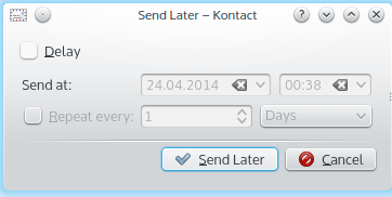
You’re absolutely right, and I don’t know why that checkbox was put in there later. I’ve updated the post to reflect that (including a screenshot of how it was immediately after our feedback).
[…] The Little Things […]
Great article. I like how the Send Later dialog looks now.
For the Join Chat Room dialog, I would suggest to go even further by merging the recent/favorite and search tabs, with a unified search/filter/sort/create text field above the list. While the user start to enter text, the list would be filtered and sorted live, with the most likely entry preselected and matching patterns highlighted (favorites before recent before chat room creation entry before search results). Yet this is far more than reorganisation of the dialog.
Actually, believe it or not, that was my idea at first as well!
The problem with this is that querying Jabber servers for rooms is a quite “expensive” and slow action. That’s the reason why we want queries to only be the “last resort” if users don’t have a better way for getting to the room they want. If it was as fast and cheap as a query of a local index, we’d surely have built it right into the first dialog people see.
About the Join Chat dialog: I think that having a search box in the bottom and, at the same time, a “Search” time will confuse newcomers. If something pointed out that the search box is only to filter Rooms it would be better, IMO.
Thanks for the article and the work. I too consider these details utterly important.
So way to go!
PS:
Your screenshots look handcropped, you know you can capture single windows (even without decoration)?
Actually I do know, but admittedly I had forgotten about that feature at the time I took those screenshots (not all of them were done by me, though).
[…] he wouldn’t have time to implement it before the Plasma 5.0 release. Shortly after Plasma 5.0 was released, Marco started implementation as promised. We decided it would make sense to start a thread in the […]