Simple by Default, Powerful When Needed
KDE (back when it was still the name of the desktop environment) and our applications historically stood for powerful features and great flexibility and customizeability. This is what our users love about our software, this is why they choose Plasma and KDE software instead of one of the other Free desktop offerings. And it is also something they would fight tooth and nail for if we wanted to take it away (as many a KDE maintainer who dared to remove a feature he thought was unnecessary can tell).
On the other hand, this power and flexibility at times leads to user interfaces that intimidate especially new users if they expose all the features they have to users at once, leading them to avoid our applications altogether. This keeps them from ever experiencing the power which they might enjoy later on, as they use an application for more advanced tasks.
With KDE4 (back then, Plasma as a brand was not born yet), the aim was to keep the power, but do away with the scariness, as the KDE4 Vision states:
“Anything that makes Linux interesting for technical users (shells, compilation, drivers, minute user settings) will be available; not as the default way of doing things, but at the user’s discretion.”
In the design vision and principles section of the KDE HIG, we condensed and evolved this goal into a simple guiding principle:
Simple by default, powerful when needed.
How do we reach that goal?
As the first step, it is necessary to define the target audience and use scenario for an application. Only if we know that, we can define which goals users should be able to reach using the application.
The next step is to define for each goal how likely our target users in the target scenario are to actually have that goal, and how regularly. As an example, when we planned KMail Active (aimed at tablet computers) a year ago, we categorized the tasks we wanted to support in three groups: common, uncommon, and rare.
Only the common actions would be accessible directly in the main user interface. Since the usage scenario we had in mind for KMail Active was “Quickly checking up on new mails on the go or at home on the sofa and occasionally reply”, only those functions relevant to that scenario were planned to be placed in the main UI.
This is how we achieved the “Simple by default goal”:

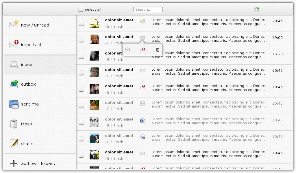
Early-stage mockup for an email client for tablet computers, to be used in Plasma Active, applying the “Simple by default. Powerful when needed” philosophy.
We optimized KMail Active for users who would rather use KMail Desktop to actually organize their emails by sorting them into folders, or try to retrieve old emails in any folder. However, we recognized that sometimes users may need to retrieve an email from some otherwise rarely used folder or tag or move an email to a certain folder in order to find it more easily later, but don’t have access to a desktop or laptop PC. Therefore a UI to browse through the whole folder hierarchy and the tags (not mocked-up yet) was included in the design, though only visible if users scrolled the view to the left.
The same goes for writing new emails. The default UI for that won’t include things like HTML formatting or adding attachments (since writing longer and more complex emails is not convenient on a device without a keyboard, and users are less likely to have documents they want to send to people on their tablet), but they, too are only presented on demand, not by default. This is the “powerful when needed” part.
This philosophy will guide the designs provided by the VDG, so you will see more examples coming up, soon!
UPDATE: As I’ve seen in some discussions of my post on the Internet (not the comments here) that people apparently thought the screenshot represented the next KMail desktop UI, I’ve updated the screenshot and the caption to make clear what it is.
UPDATE2: Now that this post has become quite popular (2.394 unique visitors so far today!), I felt the need to make clear that – as always with Free Software – all this is a team effort. The original version of the design principles Wiki page was written by Andrew Lake, the user stories for KMail Active were co-written with Heiko Tietze and Michael Bohlender, the design of the mockup was done by Michael Bohlender with my help, and Michael also contributed to the philosophy tagline, by replacing “complex” with “powerful”.
Comments: 35
While I agree in general with the philosophy, please don’t hide the advanced function TOO well. Take pity on those of us who don’t need the advanced function every day and who can’t keep track of the 1,000 and 1 ways and places to enable it.
Kindly consider something like a common-to-all-apps icon (radiation trefoil? biohazard symbol?) in a common but out-of-the-way location.
Oh, absolutely!
Discoverability is crucial, so even those functions that are not in the Main UI do need a common way of access so that users can find them.
A simple tab/button marked “Advanced” should suffice, well it would be enough for me
Well, this is how many applications are doing it now, but that is not good design.
The problem with this approach is that it assumes there is a clear separation between “casual” and “advanced” users, and that casual users need only functions ABC and only advanced users need functions DEFG.
In reality, though, some “casual” users need function D, some need E and G, some need D and F.
However, those users get scared away by an “Advanced” tab (because that’s clearly not made for them, they’re not advanced users, right?) and therefore may never find that they function they need is indeed there.
So we have to enable all users to use all features, but have to integrate those features that only few users use or people use only rarely so they “get out of the way” when they are not needed.
Just replying to your reply to me… i know quite a few users that will not even go to settings of any kind, they use it as its presented to them on installation. To search for or discover functions is also difficult because the normal users won’t even know the name of the function they are looking for or even if such a thing exists. If they are adventurous in any way, they’ll press all buttons and tabs looking for something. For example look at “System Settings”, some users are not going understand why all things desktop related are not on one icon called “Screen”. I’ll be very interested in seeing what you come up with finally, ease of use is a hard thing to capture because it is very subjective. good luck
I think its not about providing fine grain control. It is about handling complex stuff with simplicity. Compare KMail’s filtering options, where user has to make too many decisions like filter by subject, reply or keywords, with Gmail’s which has a simple “Filter messages like this” and it will make best possible assumption if criteria should be subject or keyword.
So far I am enjoying the hell out of Plasma 5. It is the best piece of technology I have seen in recent times.
There’s a reason I use Kmail as a front end to my Gmail account. If Kmail has nothing to offer over Gmail’s interface then why would I use Kmail instead of the Gmail web ui?
I don’t mind if advanced options are layered behind an “advance” option button of something like that, but don’t cater to the clueless boob at the expense of people who understand what they are doing.
Exactly, hence the layered approach instead of removing any feature which maybe not everybody will use.
The “powerful when needed” part is very important and defines what makes KDE strong.
Over the years I’ve noticed that the single hardest skill for a designer to learn is how to distinguish a use case totally orthogonal to one’s own practice from clueless noobism.
For example, if for whatever inarguable reason you’re required to coexist in a MS Excel world it doesn’t matter how excellent a competing product’s interface is if it’s wildly different from Excel’s. The effort required to keep them straight will defeat you.
Your choices are: 1) complain about the noobs who can’t be bothered to learn the new interface (at huge cost to themselves with hard-to-discover benefit) or 2) find some way to accommodate these users with the hope that you can slowly swing them over to your way of working.
If you remember, this is exactly what Excel did when it was introduced; there was a Lotus 123 mode since at the time 123 was the dominat spreadsheet package. It seems to have worked.
Please don’t misread this comment as having anything to do with kmail vs. outlook. The comment is purely about expanding your view of “bizarre” use cases.
[…] Simple by Default, Powerful When Needed […]
I have whole KDE 4 series time talked that we need to take direction where GUI is configured to be targeted as common and easy to learn, but give easy access to configurations so everyone can reconfigure GUI as they need and want without serious limitations.
Now the active one looks good, that I could even consider to be used with desktop side.
But I ask, how about removing the selection box front of the mail and make selection be started with long pressing one and then just tapping all wanted? Of course that requires too the “select all/none” function button as the screenshot version does too.
But the long press selection mode is easy as you can’t start a selecting multiple and then mistakenly open one instead select it, reversing the previous selections.
That is the way how example Android does it and works great.
There is currently work ongoing for a desktop mail client that has some similarities to this one (mostly because it’s the same developer, Michael Bohlender): https://forum.kde.org/viewtopic.php?f=285&t=122867 I just showed the Active one here because the process can be shown more clearly there.
Long press will work there as well, but we wanted to make the multi-selection discoverable for everyone, so we decided to include checkboxes as an alternative for those who are not used to long press. This is just an early mockup, though, so the final result may or may not include the checkboxes.
Simple by default — I often thought that smart by default would be a better slogan. For an email application — why is that _no_ email application apart from the Visual Basic 3 one I did in the early nineties checks whether mail belongs to a mailing list and then posts it in the right folder for that mailing list without me having to create a filter for it? Why doesn’t a word processor recognize the manual bold, big, italic marking an author applies and realizes that what it’s seeing is H1, H2, H3? Why does akonadi have a diff-like conflict resolution dialog, why doesn’t krita notice when the artist is painting on the wrong layer — if one layer is marked sketch, obviously it should be locked for non-grayscale painting.
Some great ideas in there! We found “simple” to be a better fundamental principle than “smart” because “smart” may not work well for every application (and some “smartness” can end up more annoying then helping, see auto-correct for an example of that).
However, the “smart” features you suggest here would fit the design principle “Do the heavy lifting for me. – Make complex tasks simple. Make novices feel like experts.” that is mentioned in the HIG ( https://techbase.kde.org/Projects/Usability/HIG/Presentation/DesignVisionPrinciples ). So yes, we do want such things, but for me at least, “simple” comes before “smart”.
Please enable a simpler certificate handling option within kmail! Thunderbird and Evolution make it so much easier to implement than kmail!
When working on crypto handling, I’ll make sure we’ll have a look at them, thanks!
[…] * Please say this ain’t the new Kmail […]
No, it is not.
This is a draft mockup of a tablet interface for a KDE email client, just as the text around it says.
I for one, welcome our new KDE principles overlords :-P. This principle of “simple by design, but powerful when needed” is something really interesting.
I think that this a good opportunity to provide a common way of discoverability and usage of advanced features within KDE applications. Think about complex applications that are intuitive, simple and powerful, and sublime text comes to my mind. And Google. And Krunner. See the common trend? See http://www.sublimetext.com/ and take a look at the mentioned features and apply generally to kde applications:
* Go to anything – provide a way to provide navigation between documents and maybe even widgets of the application.
* command palette – holds infrequently used functionality. With just a few keystrokes, you can search for what you want. The list will show of course the shortcuts for each actions (discoverability and ease of use). This is similar to the idea behind Help->Search option in OS X applications.
* Customize anything – This is the philosophy behind KDE, without any doubt. It just doesn’t need to have a cumbersome UI.
* Plugin API – encourage applications to use a plugins-based architecture. This is something that we might have to stress it.
* Distraction Free – the interface should be as simple as possible, as in your mockup – and as in sublime text.
It would be game-changing if we applied all this to kde apps in general =)
I have one simple requirement of a desktop: that I’m able to use it as I wish. Does that sound familiar?
That means that what’s put on the desktop by way of icons – and isn’t limited to applications – and where they’re placed is what I choose.
It also means that if I want a window maximised I deliberately choose that & don’t get it as an unwanted side-effect of putting it adjacent to some margin.
It also means that a hidden panel only pops up when the cursor hits somewhere that I select which will be the bottom left hand corner, not anywhere on the bottom margin where it gets hit reaching for a scroll-bar on an adjacent application window (KDE 4 broke 3’s impeccable behaviour very badly in this respect).
Other users’ requirements will vary so this stuff needs to be tunable. That’s not a problem as KDE has done it in the past. As others have said, this tuning needs to be easily discoverable – either by good interface design or by good documentation but preferably both.
As a developer it took a long time to really discover the secret of “less is more”. Designing in expected ways of working limits the user to those ways. Designing in LESS in the way of the expected lets the user do MORE.
On reflection, maybe the answer is to leave KDE as the desktop for grown-ups. Don’t follow the current fashion of dumbing down.
[Dear Baby Bird: I do accept criticism on my blog, but I don’t accept trolling. Your comment was so chock-full of the f-word that I could only count it as trolling. If you want your comment to be approved, please rewrite it in a civilized, constructive tone. I appreciate your feedback, I don’t appreciate your insults. Thank you.]
I like the power of KDE, but I hate that in most simple actions KDE is not that handy as Gnome. Take for example, unpacking an archive. In Nautilus you do just Unpack here, and it does it in pretty smart fashion.
I, however, use many of advanced features of Kwin, and I’d like to have these still available. Even this way: I’d like to be able to configure everything by my likening and then switch to “simple” mode, keeping my “power” settings enabled. Would that be possible?
KDE’s Dolphin actually has that feature for ages with some additions like “Extract here, autodetect subfolder” which would auto-create a new folder if the archive does not contain a root folder.
I’m not sure if this is enabled by default, but you can find it in Settings -> Services. Also, this is not yet available in Dolphin5 afaik.
@Игорь Тарасов
Good example! I like how FileRoller handles BASIC function, compare to KArk, but hate how it CAN’T deal with advanced functions, such as ‘Open with…’. I can’t select custom applications.
I like the ADVANCED functionality of KDE, but hate its COMPLICATION.
Such as, there option to open text/html with, say, Opera. But the setting in ‘Configure your desktop > Default Applications > Web Browser’ has higher priority, so, if I set FireFox as default browser, whenever open html file, it always with Firefox.
I spent much of time to figure out there two options conflict each other.
I would like to see KDE “simple by default, powerful when needed” as (Old) Opera (Presto).
Here are how (Old) Opera design their browser:
* Functionality, especially, ‘must have’ functions were there
* Simple by default: ‘Advanced’ functions are not activated such as, Mail, Note… But there OPTIONs for those want these functions.
* Powerful when needed: Clean GUI configurations. Clear, easy to understand text-base configure files. You can do nearly everything with the browsers.
Finally, I don’t like yet-another-GNOME, too basic. It’s OK for simple tasks, but when ever one want to do more than that, it’s impossible or cost much more time and effort to do than KDE.
What you’d like to see is exactly what we are aiming for. It’s not easy to do and we probably won’t get it right the first time with each design, but people can hold us accountable by our principle and we will try to come as close to this ideal as possible.
First, great work! I agree with others that the ability to discover how to do uncommon tasks is very important. I find the Mac OSX “menu search” a great solution for this purpose. (For those unaware of it: given certain keywords, it points the menu item/option where the task is). It is great for the occasional user. If you could implement this in one of the KDE libraries, all KDE apps will profit.
Perhaps you can simplify Kmail without dumbing down the user interface, but I don’t know if that’s what is intended.
By simplify, I mean clean up the function of the kwallet/akonadi/strigi/etc. mess to eliminate the constant nagging requests for passwords and notices that various email accounts are disconnected from the server. In March 2014, I installed OpenSuse and loved it — until I tried to set up Kmail and its associated demons. I chose OpenSuse because of Kmail. I wanted Kmail’s fine control and features, and found those manageable. It was the kwallet/akonadi/strigi/etc. complex that drove me back to Linux Mint. I couldn’t even figure out how to disable the kwallet/akonadi/strigi/etc. complex, which would have defeated the goal of getting Kmail anyway. I spent many hours researching and found that users with more technical expertise than I were giving up on Kmail. The concept of the semantic desktop is great, and someday it might work. However, I saw complaints that Kmail has been a problem for years and is unlikely to change. I would be delighted if Kmail became usable by people like me.
I used to use KDE with SuSE Deutschland distro but as time went on the unwashed mentally unstable flocked to it like flies to shit. They would be on every BBS preaching the word of their God Linux/desktops and shouting down anybody who questioned anything. You just could not get rid of them they were on the Internet 24 hours a day. These days you can find some of them on YouTube. It got to the point where people would pretend that they used Windows just to get away from the Linux God desktops, the friendless preaching weirdos.
Does anybody remember KDE, putting the U.S. flags on country/region on every country of the world which become local(e). That one died very fast along with KDE.
And then American English? America is a continent not a country. And then the time and date sequence was wrong. And “eye candy” everybody was asking what is eye candy? and somebody said it is to do with people from the U.S. with their joy of feeding their faces. So everything they like is called eye candy. And then eventually we learned it was sugary sweets and not candy as in female or candy floss.
And then the arguments over “trash” what is it called in Australia, or Canada New Zealand, Africa India, and the U.K., and others saying does it matter? just call it trash! and people were saying what is trash? It was getting so childish people just switched to Windows 7 and the Apple system. Linux desktops are unprofessional. There is a version from the U.K. and the language translations are perfect Japanese is good and so on it’s based on Debian. But I don’t like the desktop but it is professionally acceptable. But KDE and the like are for the hobbyists the unwashed not for the workplace.
I am from the UK and wish they would just stick to “Trash” as it keeps it less confusing when looking at the file system. (though I am less tolerant of other Americanisms like “Favorites” or “Airplane Mode” (there was nothing wrong with “Flight Mode”)!
I like this philosophy. I hope it will extend to the Plasma Desktop.
For example, at present the desktop is in a configuration mode by default with a confusing lock/unlock paradigm along with a strange “cashew” menu (or “hamburger” or whatever it is called now) by default. So much simpler would be not to throw all this in the face of the n00bs (and allowing them to easily break and accidentally move things), rather have things fixed by default but with a much more clear and explanatory “Customize Desktop” mode from a right-click menu on the desktop and panel, where it will be made obvious that the widget layout can be customized. The “Customize Desktop” mode could then make it clear that you are in a mode to customize things in a similar way to Firefox’s Customize menu option.
Kindly remember that there is a middle ground between 1) newbies who should get reasonable defaults and are not likely to change them and 2) fan-boys who will be up on everything and want to totally rearrange things regularly.
These are the people who are comfortable making changes when something pinches them but who have zero interest in change or customization for its own sake. These folks want to work in THEIR problem domain with as little interference as possible from the OS/Desktop/Whatever.
… another point is that on Aaron Siego’s blog he revealed that the reason why the desktop Cashew’s were they way they are is due to “discoverability”. However, I believe this has been excessive with the “cashews” etc. Most n00bs just want to leave things at the defaults and not fiddle, while more power-user (geek!) types who actually want to customize deeply will be right-clicking on things to explore for themselves, as well as the latter being more aware of the power that is available due to being up to date with tech news sites etc., so don’t need such complexity in their faces by default either.
[…] d’une distribution GNU/Linux. Thomas Pfeiffer, chercheur impliqué au sein du projet KDE, affirme : « c’est pourquoi nos utilisateurs aiment notre logiciel, c’est la raison pour […]
[…] design vision/motto/slogan/tagline/mantra (yes, it has been called all that!) that I described in my last blog post and which is described in more detail in the “Design Vision and Principles” page of the […]
[…] des moyens techniques, financiers et juridiques, partagés dans une ambiance familiale ! Un seul mot d’ordre : simple par défaut, puissant quand on en a besoin […]