Shared Values ⇒ Shared Ideas? What we can Learn from Firefox Australis
If you’re asking yourself “Huh? Australis? Is that edible?”, then let me explain: Australis is the codename of the new user interface that was introduced with Firefox 29 (see the Article on the Mozilla UX Blog for some background).
Australis is the result of years of design and prototyping iterations, which were lead by the recently defined Firefox Design Values. Of those values, especially one looks quite similar to the KDE design vision/motto/slogan/tagline/mantra (yes, it has been called all that!) that I described in my last blog post and which is described in more detail in the “Design Vision and Principles” page of the KDE HIG (though I swear to Stallman that I hadn’t read the Firefox Design Values when I came up with that tagline):
Theirs:
Balances power and simplicity – Firefox is simple and easy to use, clean and straightforward in its design. But simplicity is a means, not the end – the end is understanding and user-agency.
Ours:
Simple by default – Simple and inviting. KDE software is pleasant to experience and easy to use.
Powerful when needed – Power and flexibility. KDE software allows users to be effortlessly creative and efficiently productive.
Though not identical, these values are very similar in their meaning: Both the Firefox and KDE User Experience teams aim for a simple overall user interface, which still offers easy access to powerful features for those who need them. The similarity becomes clear when one compares what I’ve outlined in the aforementioned blog post with the principles which the Firefox UX team derives from that value:
80/20/2: default to surface minimalism and easy access to the rest
user-agency and understanding, not just less
Even though neither of us blatantly copied the other (they were first, but I only became aware of that document after we wrote ours), the similarity isn’t purely coincidental, either: Both KDE and Mozilla have started off from a quite tech-savvy user- as well as contributor-base, and both aim to reach a broad(er) audience without taking the powerful features which advanced users need away from them.
And – not surprisingly either – both groups came to a similar conclusion for how to solve this dilemma: Putting those things which most people use regularly on the main user interface, while offering well-integrated access to the more advanced and/or less frequently used features. In the Australis UI, there are three tiers of access to features (from most to least frequently used): The toolbar (actually, also the tab bar, but for the sake of simplicity I’ll just subsume both under “toolbar”), the button menu and the (hidden by default) classical menu bar.
However, the tricky part is that for many applications there isn’t “the normal user” and “the advanced user”, and therefore there isn’t “the normal feature” or “the advanced feature”. The same person can for example be a power user for graphics software who needs a very powerful tool for their job as a designer, but at the same time be an absolute novice when it comes to software development tools, because they have only just started teaching themselves some basic programming to be able to whip up some interactive prototypes.
A browser is one of those applications: It’s an application which every user with an Internet connection uses (with the majority using it every day they use a computer), which many use “casually” but many also use for highly sophisticated tasks (and in case of ChromeOS even for pretty much every task). Therefore there is no chance to say “An average browser user uses this and that feature, whereas an advanced browser user uses this and that feature”. The same goes for frequency of user scenarios: Some people use their browser mostly for reading on websites, others use web applications more often than “plain” websites, web designers/developers frequently use highly specialized tools.
So what did the Firefox UX team do to accommodate to that uncertainty? They made the user interface highly customizable, allowing users to populate both the toolbar and button menu with whatever UI elements they wish, as well as to rearrange the elements within each area freely. This means that users can adapt the UI to their personal usage patterns. And even UI elements that are created by addons are treated just like the ones that ship with Firefox by default.
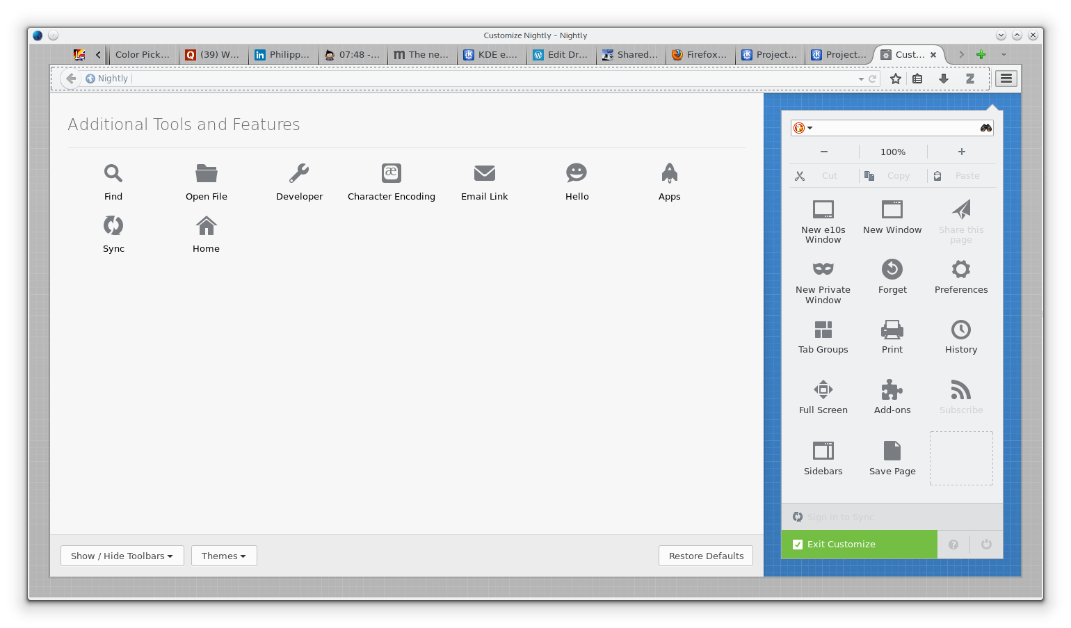
What my Firefox looks like in Customize mode – And yes, I’ve put the search bar in the friggin’ button menu, because I mostly use web shortcuts instead!
Is this high degree of customizability worth the effort for every application? Certainly not. For applications which are only rarely used or for which usage patterns are indeed highly consistent across users, a static user interface works just fine and has the big advantage for users that if they forget where a certain function is, they can consult the documentation or ask someone else, both of which are not possible if they can decide where to put it.
However, for applications which are used frequently and for which usage patterns vary between users, a flexible user interface solves the problem that even the best user research and most carefully designed default user interface cannot accommodate to the users’ idiosyncrasies. And even though some companies or designers may have made some people believe that an option is always a sign of bad user interface design, one of the dialog principles laid out in section 110 of the ISO 9241 (“Ergonomics of Human System Interaction”) is still “suitability for individualization”.
So, for all who feared that somehow KDE now decided to be “like Apple” or “like GNOME”, which translates for them to “Not giving the user any options”, fear not: In those cases where it makes sense, a flexible UI is precisely the embodiment of “Simple by default. Powerful when needed.”
Comments: 17
> search bar in the friggin’ button menu
Nice idea. I copied right away. 🙂
I just have to say that I’ve moved the search bar into the button menu for a long time too. It’s not something one would typically think possible, but it makes more sense to me. (And I’m glad I’m not the only one who does it).
Ditto. 🙂
[…] LIKE THIS???Add to favorites Posted on October 27, 2014 by Please comment By Thomas Pfeiffer (colomar) […]
Firefox’s customize menu is my least favorite part of it. I like how you could drag and drop things on Chrome and it works. On Firefox one has to open customize and then do drag and drop. One of the most important part of design is empowering when it matters and not exposing every single settings option possible. Most of the Firefox is text based but dropdown menu is button based which just makes me think it is such a drastic and unnecessary UI transition.
You can drag and drop UI elements in Chrome? Apparently it’s either only in Chrome but not in Chromium, or very very new or there is a problem with discoverability, as I haven’t found out how to rearrange UI elements by drag & drop in the Chromium I’m running yet.
I use the Chrome unstable version but I can drag and drop extensions. This feature is also available on Chrome stable. It’s mostly rearranging. Chrome has a dedicated extension area where as Firefox is more flexible as it will allow you to arrange the address bar too. I don’t see the benefit but it does that.
The big difference is that Firefox allows customization of the whole UI, not just extensions: If a user doesn’t need a UI element that comes with Firefox by default, they can just remove it from the UI, thereby reducing the set of elements on the UI (both the main UI and the menu) to the ones they actually use. In Chrome, on the other hand, the elements that are shipped by default are always there, even if you don’t need them.
Now I see that changing the menu from text-based to icon-based is the biggest criticism Australis got. The designers are aware of that but have their reasons why they’ve done it that way:
“The visual grid has some drawbacks: it isn’t as easy to scan and doesn’t scale as well with a lot of items. But the icon grid won this round because it was more visual, more inline with what we wanted out of drag-and-drop customization and had the side benefit of being touch friendly.”
Well, Chrome is very minimalistic in itself. It comes with backward, forward, refresh, address bar, and settings button. All of those are essential and can’t be removed. I am sure you will agree that you wouldn’t want to remove any of these.
Chrome is very clear. It either creates a new tab or a new window both of which are Chrome windows. Firefox still icon-gird, new tabs with test menu, and gtk wrapped windows. I find that very aesthetically unpleasing.
I use Chrome 100% time but I do come across websites that Chromes fails to render as perfectly as Firefox does. So there is that.
I was talking about the menu, which I’ve customized quite heavily in Firefox, but I can’t in Chrome.
Nice comparison 🙂
I’m using FF because of its extensibility by plugins (probably as many others). And I love KDE for the configurability. Both visions do not address this in particular. Okay, we have the flexibility, at least.
I like Australis a lot. I think the same kind of system could be used in customisable apps in KDE, such as Dolphin, or Calligra. It would be better than the current “lock/unlock” system. When you switch to “cutomise mode”, all avaible UI elements could be displayed. And the layout is locked once you exit.
Actually, this is not limited to applications. It could also replace the lock/unlock system currently used for Plasmoids. Instead of “Add widgets”, a “customise my desktop” button could be replaced, unlocking the desktop and displaying the plasmoid library. You can add, move, resize or remove plasmoids, and when you exit customise mode, your desktop layout is locked. The tricky part might be managing panels, but this deserves a closer look, as I find the current workflow is quite heavy.
Great idea about the “Customize my Desktop” mode, that could really be useful!
that is realy a cool idea. thanks
“Customise My Desktop” would also need a way for the widget library to not cover up plasmoids which you want to remove or areas where you want to drop a plasmoid. Firefox is a bit different in this regard as the interface items are strictly around the edge of the window. Could be interesting in Calligra although I think, UI wise, they have already done a pretty good job.
As a former Opera user I laught my ass at this Fx “customization” you are speaking of. It’s nearly non-existant.
If Opera allows to move specific functions freely between toolbar and menu or even remove them completely, then it’s apparently not that discoverable, because I haven’t found how to do that.