Behind the scenes of the KDE Phone HIG – Part One: Basic Assumptions
The Task
Right after Plasma Mobile was first announced at Akademy 2015, the team put me in charge of the creation of a crucial pillar of the ecosystem: The Human Interface Guidelines for KDE phone applications. This means guidelines for “applications made by KDE for phones”, not “applications made for KDE Phone”, because
- There is no “KDE Phone”, just the phone UI of Plasma Mobile
- KDE applications for phones do not only run on Plasma Mobile, but may also run on e.g. Android, Ubuntu Touch or Sailfish OS
Of course third parties who design applications for Plasma Mobile should follow these guidelines as well.
Fortunately, I wasn’t alone with the herculean task of writing the HIG. Alex L. and Andrea del Sarto, two designers who started posting amazing Plasma Mobile mockups on Google+ right after it was announced, joined the effort right away.
We met in a Telegram group to discuss our ideas, and I started putting whatever we agreed upon on the Wiki, accompanied by mockups from Alex.
A HIG is not written in a day, though. The first step is thinking about some basic assumptions from which to derive basic interaction principles that some or all KDE phone applications will likely have in common. These assumptions and basic principles take the longest to come up with, because if they are to be used across most or all of KDE’s apps, they have to be very robust and applicable very generally.
So here are some of the assumptions we made so far and user interface patterns we derived from them:
1. Convergence is the goal, but each device gets its optimized UI
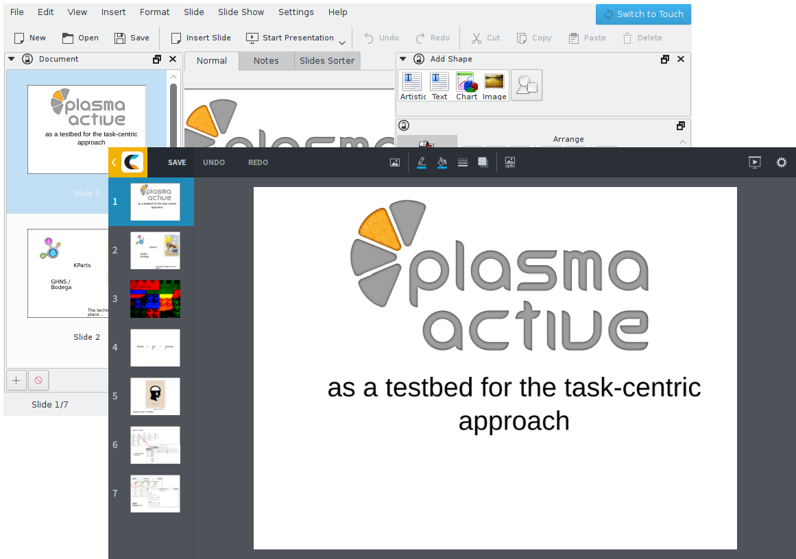
Calligra Gemini as an example for a converged application
We live in a world where barriers between different device classes become more and more blurred. Tablets become laptops by attaching hardware keyboards and pointing devices, smartphones can be put into docking stations that turn them into desktop PCs, a smartphone can turn a TV into a mediacenter.
One approach to deal with such a converging world is to simply scale user interfaces to fit the screen, but this is far from ideal. A smartphone isn’t just a laptop with a smaller screen where the mouse is replaced by your finger, and even tablets and smartphones are used differently.
A device used with keyboard and mouse can use interaction methods like mouse-over, right-/middle-click or keyboard shortcuts, which are not available on a touchscreen. A touchscreen, on the other hand, can use all kinds of gestures which are unavailable on a mouse.
The input method is not the only important difference, however. For another example, a phone is mostly used in portrait mode and often interacted with using only one hand (with the other hand either holding the phone or not touching it at all) , whereas a tablet is mostly used in landscape mode with both hands available. These differences may seem superficial at first, but if you want to create user interfaces that feel truly comfortable, you can’t just ignore them and simply scale your UI to the target screen size and pixel density.
One HIG to rule them all
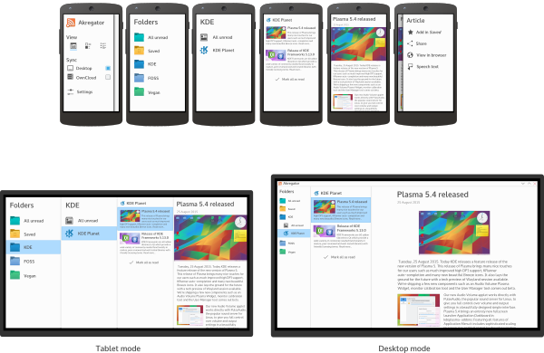
Therefore, KDE approaches convergence by designing optimized user interfaces for each device class the application targets, often even with different task priorities: As you can see in the screenshots above, Calligra Gemini Stage focuses on creation or fundamental editing of presentations in desktop mode, whereas tablet mode is focused on interactive presentations and minor touch-ups.
Nevertheless, we want designers/ developers to keep all target device classes in mind when designing a UI, which is why I decided against completely separating phone, tablet and desktop Human Interface Guidelines. Instead, currently the guidelines for different form factors are just different sections on the same page, with guidelines that apply to all device classes at the beginning. We might adjust that organization in the future, but there will always be just one central HIG document which only branches out where the guidelines for different device classes actually diverge.
2. Phones are more for communication and content consumption than for content creation
As already seen in the example of Calligra Gemini, different devices have their strengths for different tasks. Phones are great for checking news or emails on the go, but writing a book or even just creating a presentation on a phone isn’t much fun. Following this assumption, the phone HIG emphasizes patterns for browsing and viewing content over those for creating it.
3. Users prefer to interact with the center of the screen
A typical way of holding a phone, making the center of the screen the easiest to reach
As research shows, smartphones are predominantly held upright (portrait mode) and in one hand, simply because that is the most convenient way to use it and it leaves one hand free e.g. to hold onto something while standing in a bus.
If we want an application to be used conveniently with one hand, we have to make sure that everything that is needed often can be reached with that hand’s thumb without having to reposition the hand (although the aforementioned research also shows that people do switch how they hold their phone whenever needed).
Regardless of the way users hold their phone, research shows they generally are more precise in interacting with – and prefer to interact with – the center of the screen.
Based on these findings, the HIG recommends interaction patterns which do not require users to reach for the far ends of the screen (mostly the top), but give them on-demand controls near the center of the screen.
4. Space is limited, and content is king.
Although smartphone screens have been getting bigger and bigger over time, they are still very small compared to laptop or desktop screens. Since neither readability nor comfortable interaction should be sacrificed by just making things smaller, we have to find other ways to save space compared to desktop or tablet user interfaces.
In combination with assumption 2) that most phone applications are used more for viewing than for manipulating content, this leads us to the approach that the limited screen space should be mostly reserved for content, with controls only exposed when needed.
5. Content often has a hierarchical structure
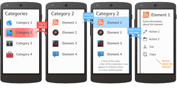
Column-based navigation according to the HIG
We have found that often the content to be browsed through has an inherent hierarchical structure. Whether it’s files in a folder hierarchy, emails in (sub)folders in accounts, news items in feeds (optionally) in folders or tracks in albums by artists, one often has several levels of hierarchy to browse through to get to the object one wants to see.
And since navigating through that hierarchy is often one of the tasks the user performs most often with these applications, optimizing the interaction for that task will make using the application overall more efficient and a more pleasant experience.
What’s next?
With these assumptions in mind, we set out to create the actual Human Interface Guidelines. In part 2 of this series, I will talk about the process of we write the HIGs while Marco Martin is working on creating components to help developers create HIG-compliant applications easily.
Now I’d like to know, dear reader: Do you agree with our assumptions, or do you disagree with some of them? I’d love to hear your opinion in the comments!
Comments: 18
HIG wise spoken content that is organized in trees on the desktop should get flattened into simple lists. Maybe you are right and we cannot provide tree-like controls on the phone. I’d really like to hear opinions from the community.
Looking forward alternatives to the column-based navigation. 🙂
Cool stuff! Exciting to see the progress.
This is a great discussion. One thing that annoys me to no end is the “actions bar at the top” paradigm. Take the facebook app, for example. Having the bar at the top makes it difficult for my thumbs to reach the top of the screen which, in turn, makes me have to shift the phone on my hand and, sometimes, lose grip and drop the phone. Moreover, in order to balance the phone in my hand, my thumb is typically covering the bottom 10%-25% of the screen. If the action bar was at the bottom then it would be more easily “thumb-accessible” while at the same time increasing the viewing, non-thumb-covered area of screen and favour grip.
Exactly! This is why we want to keep all important controls away from the top, and why our toolbar will be at the bottom or in side drawers (and there vertically in the center instead of the top)
you wrote: “KDE applications for phones do not only run on Plasma Mobile, but may also run on e.g. Android or Ubuntu Touch”
and Sailfish Os! 😀
Good point, I’ll add that, thanks!
Something of note: in Sailfish OS the screen edge swipes are reserved for system-level actions, such as backgrounding the current application or bringing up the events view.
Indeed. For our apps to work well in Sailfish, we’d have to adjust them. We didn’t want to forbid using edge swipes because of Sailfish, though, since our main target platforms will be Plasma Mobile and Android, neither of which use the left and right edges for the system.
As far as I know, in all material design apps from Google and in the MD specs there is always an alternative button to trigger the edge swipe (eg the Hamburger icon to trigger the navigation drawer).
There for I never had a problem using an android app in Sailfish.
Our idea is to make those alternative buttons conditional on the environment the application runs in. The reason for that is that we don’t want to reduce the amount of space given to the content on Plasma Mobile just because Sailfish uses the edges for system functions, but we still want to allow our apps to run on Sailfish, of course.
This first post of the serie is really promising! Just one clarification: the output of this work is just guideline for gui designers or it is the base for a new framework embracing desktop and mobile worlds? I mean, are you planning widgets that transparently morph themself with the context, not only graphically but also filtering features for the user?
Very thanks and good work.
Thanks!
As said in the first assumption, we believe that usually, designers and developers have to design individual user interfaces for desktop and mobile to provide the optimal experience on each device class, and this cannot be completely automated.
That said, individual components do and will provide automatic platform adaptations. For example, a scrollable list automatically shows a a clickable scrollbar in a mouse-controlled environment, whereas it only shows a scroll position indicator while scrolling on a mobile device.
Both, actually. Marco is working on the components that translate these UI concepts into re-usable QtQuick classes.
In part, we already have this, but on a lower level: the basic widgets do already morph depending on the environment they run on, for example between touch and mouse input, or depending on the screen pixel density. We want to bring these concepts to a higher level as well. Technically, there are multiple tricks that can be applied to achieve the effect: responsive layouting, conditionals based on environment variables, different “toolbar” and context menu implementations per target device (e.g. the side swipe menu on mobile vs. the right click context menu on desktops).
All this needs to be planned on a higher level, the blueprint description of all this is the HIG Thomas talks about.
[…] sobre el concepto a seguir en cuanto a interfaces y maneras de uso. Uno de los desarrolladores deja en su blog un extenso artículo al […]
That pretty much covers what’s really annoying in Jolla or Android.
“Covers” as in “Fixes it” or as in “Repeats their mistakes”?
[…] for designing user interfaces for mobile applications by KDE). Therefore, the third part of my blog series about the HIG creation still has to wait a […]
[…] and obviously we will introduce our innovations in mobile world! Thomas already blog about this (part 1 & part 2), and now I’m going to update you about recent news; the subjects of our work […]